Vintage contemporary kitchen
Post from EditorialsA kitchen design that combines two opposing trends, vintage and contemporary, resulting in a mixture of styles in perfect synergy and functionality.
Vintage contemporary kitchen
The latest trends in interior design, look like an informal mixture, between the vintage, ie the recovery of furniture from the recent past, and the ultra-modern design, to form a single assembly that gives space and freedom, to personal creativity.
In my design, I represented an idea of a kitchen with a unique flavor, which sees precisely, the association between opposites, on the one hand the current design, and on the other, the nostalgic return to the past.
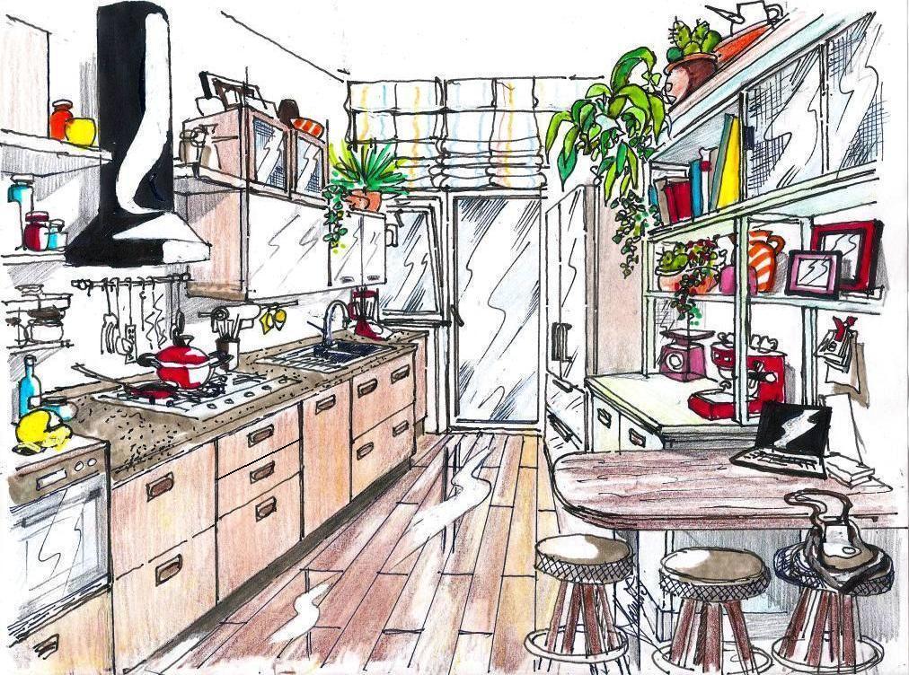
This is a project of medium size kitchen, rectangular in shape, 2.50 m wide x 3.50 m long, with a central entrance, which reflects the door - window overlooking the balcony.
Going into the kitchen space, we have on our right, a comfortable peninsula table- office, fixed to the wall, and supported by a single cylindrical tube made of steel.
It is made of solid oak, and it can cover two functions, both of lunch, and angle - study, spacious enogh to accommodate up to 3 people; in fact there is space enough for three stools with circular design with wood structure and brushed steel, and the seat can be made of leather or faux leather in black color.
The material that makes up the cupboard, is poplar wood, with its characteristic open grain, and painted in a delicate sage green.
From the base there is a shelf with raised mixed racks, ie with both open compartments, and closed with glass doors with wire braided hoses, decidedly retro flavor. A nice fridge - freezer freestanding steel 4-door, or free-standing, full pantry.
On the left wall, starting from the entrance, is visible at first the column oven, which is lowered, to allow also the use of its upper part, as a support surface.
Then follows the linear top in slate, with its characteristic dark gray color, which are encased steel hob with 5 burners, 2 bowl sink and a drainer.
The base of the linear top, are equipped with drawers and baskets extracyable, where the built-in dishwasher find its space, while the front of the doors are in the same oak of the table, as well as the handles that are always in burnished metal, in combination with those of the cupboard.
 Note how the last base adjacent to the window to the flap infix, present a reduced depth compared to the other, to allow the easy opening of the door -window.
On this small base you can place your food processor, to use it enjoing natural light.
The back of the kitchen - washing space, can be in pure white shiny quartz, recalling the whiteness of the masonry wall. All this is complemented by shelves and cabinets, arranged asymmetrically, among them the large cylindrical hood in black lacquered metal.
The structural parts of cabinets and shelves are in oak, while the fronts are alternately wired glass, oak and glossy white lacquered, to be a deliberately random miscellany.
Stands out the porcelain tile flooring with ld wood effect, available at IPERCERAMICA, Leroy Merlin or Cotto d'Este. It is an ideal material for the kitchen environment, due to the characteristics of wear resistance, and ease of maintenance and cleaning; such flooring, being constituted by longitudinal strips, gives the effect of an increase of depth to the space.
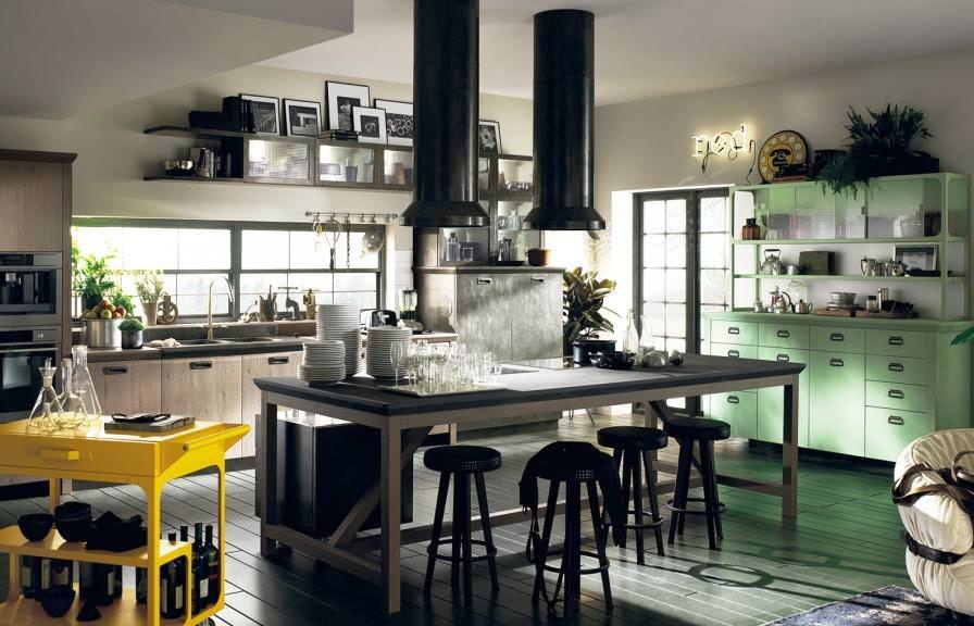
In the photo above, an example of a kitchen where vintage meets innovation, and is the model Diesel Social Kitchen by Scavolini, with island, similar models are also produced by other companies, including Snaidero or Lube.
Features in the kitchen

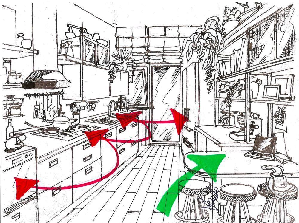
In my graphic black and white, I highlighted with arrows, the various features in the kitchen, which are typical of the triangle of functions, which should be focused, and well-spaced to facilitate the openings of the various elements, and allow for large movements.
The red arrows indicate counterclockwise, given the layout of this kitchen, the first area of basic pantry and food storage, so the area reserved for cleaning and preparation, and finally the third stage, for cooking, represented by cooking and baking tops.
With the green arrow is indicated the dining and service areas, which is an integral part of any kitchen, without constituting an obstacle to the performance of other operations mentioned.
79870 REGISTERED USERS


