Custom kitchen
Post from EditorialsOrganize a satisfactory environment dedicated to the kitchen is essential because only in this way we will be able to work comfortably.
How to arrange the different areas in the kitchen
To design at best the arrangement of a kitchen is not always easy. We begin by considering, in the space, the various functional areas. The organization and, above all, the arrangement of several workstations, or the cooking area, one dedicated to washing and one for storing food and dishes, must deal with the space that is actually available.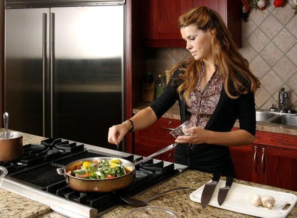
The operation takes into account several parameters, but in any case we must choose the ergonomic solutions, that allow us to take advantage of every possible angle, even with some stratagem composition of furniture that we are going to settle.
Among the basic expedients to opt for is the one to compose the kitchen so as to satisfy the ideal geometric paths, a kind of imaginary path with precise focal points, namely:
the cooking zone, with hob and oven;
the area of food preparation;
the area of washing, with the sink and the dishwasher; 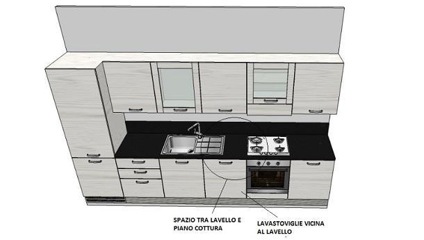
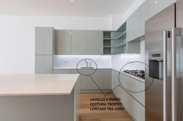
Obviously the actual sequence changes depending on whether the food is placed in-line, L, U, or on two sides, facing one another. In any case, it suffices to consider some points in the design. For example, one important thing to keep in mind is to try to fix stove and sink on the same side, if the composition of the food provides more than one. In this way you avoid dangerous bustle to those who work with pots that burn or drip.
Alternatively, the two stations should, however, be as close as possible, even if placed in parallel planes, as in the first image.
Another trick, always in this area of work very delicate, is to leave a space as large as possible between the cooking area and sink in order to better manage the operations of preparation and prevent splashing water from reaching the fires.
Watch out also for the smallest spaces in the kitchen
 A kitchen furniture must be sufficient to contain and to better manage the cooking and washing, but must also be comfortable and with minimum space necessary, unimpeded passages easy and normal movements in an environment so busy.
The diversity in the arrangement of the various operational areas is, of course, depending on the size of the environment, taking into account the possibility that there are only the kitchen furniture or that is provided for the presence of the dining table, a simple snack top or both. In this last case we must take into account not only the dimensions of tables and chairs, but also the space to be vacated for the openings of doors, drawers and appliances.
It is important to provide a space in front of the appliance enough to let people pass easily even when they are open. In this regard, for example, if the kitchen is equipped on two front sides, leave a space of at least 150 cm for the opening of the dishwasher or other appliance.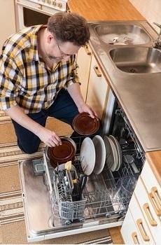 Add that, especially in the presence of a dishwasher, not just simply leave space opening of the door, but you have to take into account the room for maneuver to be able to comfortably operate also using the sink for rinsing before the commissioning of appliance.
It goes without saying, therefore, that the dishwasher is to be positioned in the immediate vicinity of the sink itself, also in order to exploit the same wall drain, with a hydraulic system for ad hoc multiple outputs, to arrange exploiting the space under the sink that, for this reason, does not have the backrest, or simply has a clamp at the base.
As regards, in general, the minimum space in front of the working plane, the ideal would be about 120 cm. so as to allow comfortable passage of two people.
Importance of color in the kitchen
Once you have chosen in the design phase the position of the furniture and appliances, we have to choose the right color of our kitchen, in tune with our personal tastes and, therefore, with the rest of the furniture.
Let's leave the White representing, in each case, the color used and always trendy in any environment, from the modern one where we find this color/ non-color versions shiny and opaque, especially where it appears to the classic version nuanced open pore or pickled.
Here we have some of the other colors used, although trends to alternate depending on the time and trends: 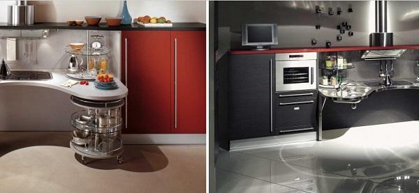
1) Red: the color is ideal if we have a strong character and determination and is also designed to warm up cold places. For those wishing to venture is to be taken for the whole composition, or even just small details, or, perhaps, to emphasize some formal choices or give importance to some elements, such as, for example, open shelves or the work top.
2) Yellow: is a warm color, suitable for cooking in any version and shades, from the lightest to the most lively, and also solves the problems of low areas exposed to the light as it has the ability to make bright environments.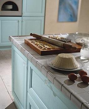 3) Orange: a color is still going strong even though it has seen better days. Currently it is mainly used in versions of models of kitchen with glass doors lacquered of this color and where there are accessories in steel or aluminum to accentuate the hi-tech effect.
4) Blue: is a very elegant color, always. Some of the shades in blue can have a relaxing and calming effect and are very appreciated in compositions country in version lacquered open pore. The color rather darker, typical of lacquer on the doors of modern models, has the effect of restricting environments and therefore can be used in very spacious kitchens.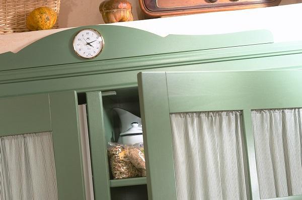
5) Green: a color is not easy to insert in the interior design and is definitely the color that promotes focus and concentration. As for the blue, and as an alternative to the latter, the green in the lighter shade is much appreciated on models of country kitchens classic or otherwise, of lacquered doors open pore.
Taylor made kitchens
Not only through the work of the carpenter. We talk about fitted kitchens, referring mainly handcrafted pieces. In fact, nearly all companies are able to meet the needs of any type as regards measures and special solutions, for each environment.
The kitchens, modern style, in fact, and I do not mean just the style, but the type of production itself, are based on a modular design that is common to adapt to any space. The same solution, innovative compared to blocks of a few decades ago but now common, the work plan one that connects the entire composition, means that all the kitchens are now tailored. 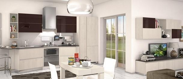
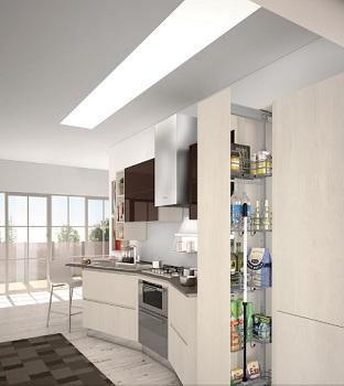 Any solution can be solved with the modules normally in production, with, at most, the insertion of small infill elements of the same finishes, which also represent the only pieces to size.
The reason is also very simple: having to accommodate appliances mostly recessed, most of the furniture of a kitchen must still comply with the measures of these elements.
Once established these modularity, and then, the rest of the composition respects proportions and symmetries or asymmetries designed specifically to make the composition aesthetically acceptable. This is true in the case of modern kitchens as well as for the classic.
That is why today it is not always easy to see the difference between a kitchen and a woodworking industrial production.
The situation is different to deal with if the food in question must resume finishes, colors, materials and style of the rest of the furniture. It especially happens in the embodiments so-called turnkey where most of the time, although not always, the main material is wood. 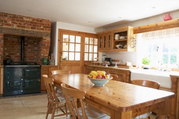
In this case there are companies that make custom-made all the furniture and then the kitchen, always based on modularity which I mentioned, otherwise it would be impossible to combine essential appliances such as oven, dishwasher and fridge, or the hood, to example. It is a condition in which the materials are mainly to be personalized, as in the case, in fact, a particular wood, which must be the same for parquet or wood paneling or the fixtures.
But that's another story ...
Images: Marchi Group , SICC , Vismap , Snaidero
80882 REGISTERED USERS


