The magic of colors
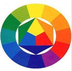
Post from EditorialsThe Itten's color wheel, showing relationships between colors, can guide us when it comes to choose and match the design of our home.
Sight and colors
In general, color gives to men a great pleasure. The eye needs it like it needs light.
In this sentence Goethe summed up the basic perceptions of color: the physical one - the color is light - and psychic - the colors generate feelings and emotions.
Our eye perceives only a small part of the light waves in nature.
These match a spectrum of seven colors: red, orange, yellow, green, blue, indigo and violet.
The English physicist Isaac Newton showed, in 1672, that the light, which we see white, is actually composed of the seven colors of the solar spectrum.
In his experiment Newton let a beam of light through a crystal prysm.
The beam broke up the seven colors of the spectrum, showing that the white is the sum of those colors. The object that reflects all the light waves appears white (white = sum of all colors);
the object that absorbs all wavelengths, without return ing them to our eyes, is seen by our eyes black (black = no color);
the object that absorbs all wavelengths except one, has the color corresponding to that single wave (eg, an object that does not absorb the green, is seen by our eyes green).
For this reason, some artists define white and black non colors because white is the sum of all colors, black the absence of color.
Theories about colors
Newton, Steiner, Itten, Chevreul, are some of the most well-known scholars who have studied the light and its colors.
There are several theories developed among which the well known Itten's color wheel, ie the chromatic circle that can be used to sort visually the primary colors (blue, red and yellow) and the secondary ones (orange, green and violet) that are obtained from their combination. The opposite colors on the color wheel are called complementary.
Combining them they are enhanced and become more vivid.
By combining instead the colors that are in the same segment, you get harmony and balance.
How to tell if the combination is guessed?
Mario Bisson, a professor at the Polytechnic of Milan and Scientific Director of the Color Laboratory of the Faculty of Industrial Design, in an interview replied:
- The combination of colors is dictated by finding a relationship between them: when it fails it creates a perceptual dissonance.
Color can help us to live better?
How can we use them in our houses?
- The color is charm and intrigue, says Bisson, To work with the color you need to know that it tricks all the time. That's why it can not count only on a theory, one must experience it. In the field of visual perception there is a discrepancy between physical fact and psychic effect.
To the question: What is the relationship between colors and mood? He replied:
- Very strong. In any environment, the color must deal with the forms, functions, perception in all senses.
Take for example purple: how and where to use it?
- Anywhere but carefully. Remember that the color changes with daylight and artificial light.
How can we know if it is suitable to our house?
- Just doing the tests: day and night, in relation to all components of the project.
What colors you can match the purple to?
- In theory to all of them. The key issue is to choose the right shade of purple.
How to match colors by knowing the characteristics
To match up colors carefully, if you want to achieve particular effects, you should first of all know the partition and some of the effects of their combinations.
The partition of colors:
The colors are divided into primary, secondary and tertiary.
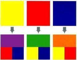
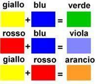
The primary colors are red, blue and yellow; are defined as such because they can not be generated by other colors. The secondary colors are green, purple and orange; they are obtained by mixing two primary colors in equal parts.
Instead mixing two primary colors in different proportions, you get tertiary colors.
Within the primary and secondary colors, there are three pairs of said complementary colors.
Each pair of complementary colors is formed by a primary and a secondary obtained by mixing the other two primaries.
To know which is the complement of the primary color yellow, simply mix the two other primary red and blue: so you get the purple is the complement of yellow (green is the complement of red, orange is the complement of blue).
Each pair of complementary has in it a little bright color and a very bright one.
In couples yellow and purple, red and green, orange and blue, the first color is much brighter than the second. If you approach the complementary colors is an effect of maximum contrast, the two chromatic colors gain strength reinforcing each other the brightness of both.
If you put a bright color at the center of its complement less bright, the contrast effect and complementarity is particularly evident.
Warm and cold colors:
The colors have a temperature and consist of hot, cold and neutral in accordance with the different sensations that transmit images and situations that bring to mind.
The reds, yellows and orange are bright and are associated with sunlight and its heat, while blues, violets and greens evoke snow, ice, sea, sky.
Are warm the colors that tend to orange and red, cold are the ones that tend to purple and blue, neutral ones are those that tend to black, white and gray.
The colors affect each other and it is possible that the predominance of cool colors face overshadowing the presence of warm colors and vice versa.
Even the secondary colors are divided into warm and cold. The green is cold because formed by the combination of a yellow and a blue cold cold.
The effect of adjacent colors:
A color can seem warmer or colder depending on the context in which it is placed.
For example, violet is an intermediate color obtained by the combination of blue (cold) and red (warm); next to a warm color such as red, it looks cool, while close to a cool color such as blue, it looks hot.
.jpg)
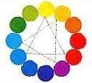
 Harmonic combinations of two colors:
each axis passing through the center connects an harmonic pair of complementary colors.
Harmonic combinations with three colors:
at each rotation of the triangle, its vertices identified three colors in harmony with each other.
Exploiting the temperature of a color you can obtain many effects.
Knowing how to take advantage of this feature, you can play with the principles of perspective creating really special effects: warm colors have the power to move forward, seeming to cater to the observer, and the cold seems to go away.
Infinite are the experiments that can be done thanks to the use of different colors and the same number can be the effects of a same environment treated with different colors.
79895 REGISTERED USERS


