Decorating the house with maps and charts of design
Post from EditorialsTo give a touch of originality to the walls of the house the best solution is to hang paintings, photographs or, why not, maps of design.
Decorating the house with prints and paintings
 Inhabit a new space or rethink an already structured one means to indulge in the conformation and furnishing of the same: once the kitchen is chosen, the furniture for the living room and bedrooms, coatings for bathrooms, flooring and wall colors, there is nothing else to do than to adorn the walls with paintings, photographs and prints to fully customize the space.
The choice is endless and is conditioned by the taste of your own home and from the furniture: once you have chosen the theme you will need to choose the right setting, as well as a right and designed lighting that can make the most of the subject and the wall that will host them.
Decorating the house with maps and maps of design
Aside from paintings, often very expensive if made in a single copy and photographs from the very personal subject, you can decorate the rooms with prints having for topic maps and plans of the city.
Of course, the subject is not so original, since the first maps drawn with a modern conception of the world date back to the thirteenth century, but with the advent of GPS and web browsing, maps lose their original function to assume the one of pure ornament.
The world maps, the political and physical maps, the road maps, no longer as a guide and 2D visualization of the world, a state or a city, but reworked and redesigned with different media or computer graphics, they become real works of art to be exhibited in museums and on the walls of your house.
In the living room or, why not, in the bedrooms prints are able to give a fresh feel to the rooms.
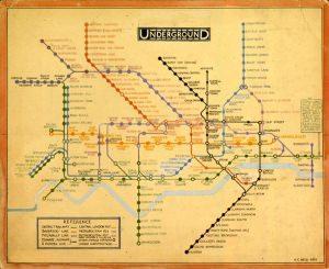
Let's start with one of the first examples of graphic schematization of a space, a service, specifically in the transport system in London.
 It dates back to 1931, the first map of the London Underground that does not pursue the goal of representing the various stops in scale but to do schematically, in order to have a more immediate understanding of the various moves to do to reach your desired destination.
After initial skepticism, the map, drawn by Charles Harry Beck, was taken as reference by many graphics designers and for the creation of maps for other cities.
From there, many steps have been made both in the techniques of representation and in the use of digital media can facilitate and differentiate how to return.
Many artists and graphic designers have ventured into the implementation and revision of maps and maps with techniques and styles very imaginative.
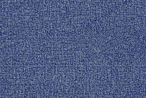
 Let's start by Chinese artist Lu Xinjian that, from aerial views from Google Earth, has represented many cities of the world, the most important, through a network of lines and curves that delimit the streets, the blocks and the various districts.
Merano, Sidney, New York, Lugano, are just some of the cities marked by the use of geometry and color: the image shows the acrylic on canvas of Manhattan.
Another original idea is to represent states, continents or the entire world through splashes of color: the British artist Michael Tompsett is the author of prints depicting Australia, Italy, England or even some of the buildings the most important symbol of the world through sketches, seemingly random colors that reproduce the overall conformation of the same.
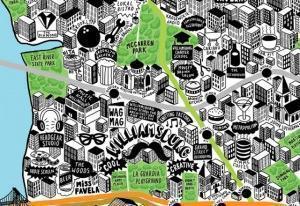
 I can not report a magnificent work done by hand in the digital age: the illustrator Jenni Sparks has a strong passion for the representation at hand and is the author of humorous drawings and illustrations, similar to comics.
On the basis of the work done for the city of London, his latest creation covers the map of New York: in it the buildings represented in 3D are traversed by metro lines, parks and alternating representations of pop bars, museums, restaurants, shops, etc..
Finally a hint of an Italian case, ie the elaboration of the Milan subway by a young Russian designer: Dmitry Goloub, of his own free initiative, has rethought the map of Milan proposing new styles and especially softer lines.
Although this is a simple personnel proposal, the news immediately made the rounds of the web bringing with it nationalist controversy.
But since we're talking about art, nothing is more welcome than creativity.
© All rights reserved
FIND
Register as User
80882 REGISTERED USERS
80882 REGISTERED USERS
SHOWCASE: TIPS FROM THE COMPANIES
SERVICES ON HOUSE FOR REGISTERED USERS


