Kitchen layout, some ideas
Post from EditorialsI take inspiration by various requests from our website's blogs to give some simple kitchen layout ideas to compose your kitchen in an open space environment.
Kitchen in the attic
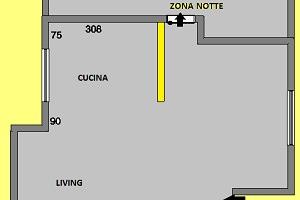 I take inspiration by various requests from our website's blogs to give some simple design ideas to compose your kitchen in an open space environment.
The initial request concerned a kitchen layout in an attic, but the proposals are suitable to any context, since, in this case, the ceiling heights were not such as to influence decisively the composition itself.
The constraints, instead, came from the plan itself of the flat, and from doors and windows position.
L- shaped kitchen
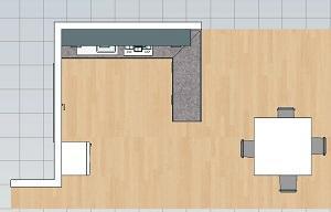
The first proposal suggests eliminating the wall, the yellow coloured one, which partially divides the kitchen area from the rest of the living room, and that also creates a sort of open corridor just to hide the door to bedroom area.
This solution provides a peninsula to divide the two areas, without upper cabinets, so as to avoid closing off the kitchen itself from the rest of the living room. Upper cabinets only occupy the long side of the kitchen.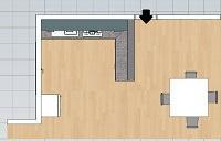
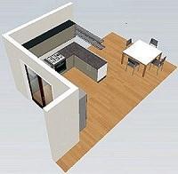 This peninsula towards the dining area will serve, as well as to divide, simply as a working area during the preparation of foods, because the worktop, here, is only 60 cm wide so it does not serve as a snack area, also given the proximity of the table itself.
To accentuate the division effect in an aesthetically pleasing way you can provide for the insertion of 2 shelves resting on the piece of free wall on which the wall units are arranged. These 2 shelves will follow for the entire length the peninsula towards the dining area. In this way they will cover, even if partially, the last side of the wall units, for a better final effect especially when you enter the dining room from the bedrooms area.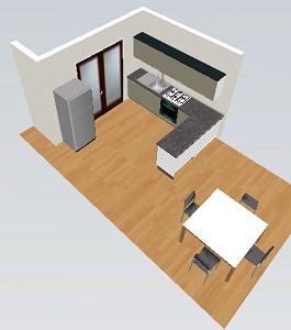 As regards the composition of the kitchen, once I verified the right measures for the position of water and gas systems and the fact that there are no particular problems with heights, although it is an attic, I started from the left side to fix the dishwasher, 60 cm wide, just under the drip tray of a stainless steel sink.
The sink cabinet with 1 door is 60 cm wide, and its location should provide space for the water and gas pipes, which need an area ranging from 70 to 110 cm from the left. Then I placed an L-shaped corner cabinet on the right, leaving 60 cm free on the left.
This type of corner cabinet is the most convenient to use because it allows you to manage the complete opening of the 2 doors in order to have a complete view of its inside. Next, on the left, I placed the 60 cm cabinet for oven and hob with 4 burners.
At this point, the remaining available space on this wall will be solved with a made to measure cabinet, if less than 15 cm, or with a practical 15 cm pull-out baskets cabinet.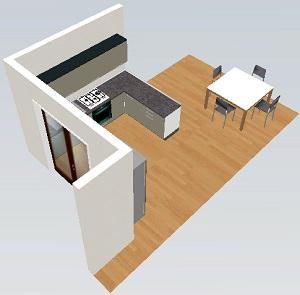
The last cabinet of the peninsula is 90 cm wide, with 3 drawers. The free standing refrigerator is placed on the free wall beside the door.
I chose to use built-in hood and wall units with flap doors, 60 cm high, then lower than the classic ones ( 72 cm high), so as to accentuate the horizontal design of the composition. A normal laminate panel, made by the same company that provides kitchen cabinets, will be used to finish back and side of the peninsula.
Kitchen layout: one wall design and peninsula
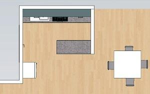 The alternative solution to this first one provides that the dividing wall remains and the composition of the kitchen is designed on the main wall. The peninsula is placed parallel to the kitchen, perpendicularly to the dividing wall, which can perhaps best fulfill its role, for privacy of those who are working in the kitchen, as well as for better management of odors and vapors.
As regards the composition, I have maintained quite the same pieces of kitchen's furniture, 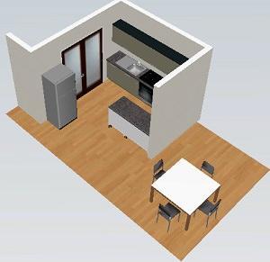 such as the sink, the dishwasher and the 60 cm high wall units, and I only changed the size of the hob, now 70 cm wide, with 4 or 5 burners. In fact, thanks to the inclusion of a 15 cm cabinet, placed laterally to the 60 cm one, the worktop has been enlarged.
This way I have been able to place a big 90 cm cabinet with 3 drawers. The peninsula against the wall is composed of 2 simple cabinets with internal shelves: the first is 60 cm wide, the second 90 cm wide, with 2 doors.
Even in this case a laminate panel is needed for the finishing of back and side of the peninsula, with the same surface treatment of the cabinets' door.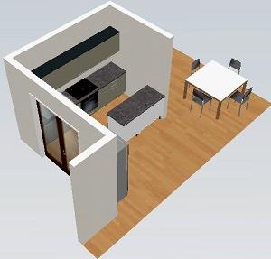 Simply, in this case, you have to consider a rear-finished worktop.
Both solutions are valid, while changing the general layout of the dining area, it depends on what is the visual impact you want to give to the room. I mean it is important to consider if you want to accentuate the open space style or you prefer a division of the two areas, instead, especially in anticipation of more formal lunches and dinners.
79870 REGISTERED USERS


