Gray color to repaint the house
Post from EditorialsSome brief tips on gray color can easily enhance the contrast or the affinity for the furniture components present in an indoor environment.
The gray color
It is customary to believe that gray is a non pleasant color, insignificant, or that it is not at all a color. In the collective consciousness, gray has a negative meaning to the point that we use it to describe something unpleasant, whether it's a situation, thing or person, calling it gray.  The idea that gray is devoid of character and not stimulating, however, is wrong. In the field of furniture is on the contrary an opportunity, far from being static and insignificant, monotonous and flat.
The classic pictorial conception considers the gray as an off-white, then obtained by adding varying amounts of black to white. Similarly, the modern graphics programs integrate in their own color palette infinite shades of gray, made by percentage increases in black. A gray obtained as a simple mixture of black and white is a neutral color and therefore, from the point of view of the emotional charge, rather weak.
However, there are other gray and other methods to obtain them, mixing the three primary colors blue, red and yellow. Modern software get the gray by mixing the three primary colors: cyan, magenta and yellow. This kind of gray, anything but neutral, can create effects of great visual impact, as well as arousing strong effects on the psycho-emotional sphere.
The potential of gray are born from its apparent neutrality. The gray is not completely neutral, indeed is itself a color, as very measured, and thus brings with it all the multiple emotional and psycho-physical characteristics typical of each color.
Decorating with gray
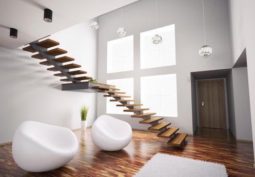
The gray allows both to emphasize the shapes and the material of which an object is composed, in the case of walls rather than components of furniture, is to highlight the other colors that surround or in part make up the object itself. It is clear that a total gray make austere and frustrating a room in a psycho-emotional point of view, but it is equally true that properly dosed and combined, it makes a place vibrant and gives depth to the different objects contained therein. The gray can be considered as a field, or a background above which each color stands out more and better than on a white sheet or on a blackboard. In fact, in the first case the whites and the pastel colors would lose effectiveness, in the second case would lose strength blacks and darker shades.
Appropriately loaded, has the advantage of highlighting all the colors, light and dark, and highlight the material qualities of furniture components, whether it's rough wooden surfaces whether is a shiny enamel surface. It is therefore very versatile, for the inherent adaptability to other colors, characteristic evident in clothing but still little explored in the field of furniture where they often underestimate the scope. In practice, very often we have to deal with existing irreplaceable items such as floors, plumbing, windows and furniture. Our favorite color could match very well to doors and windows but squeak with the hue of the parquet. In these cases, the result is often not convincing and, paradoxically, the favorite color is unpleasant because it enhances the furniture components present in the room and it results diminished itself. An ad hoc choice of right gray could solve this problem and give very satisfactory results.
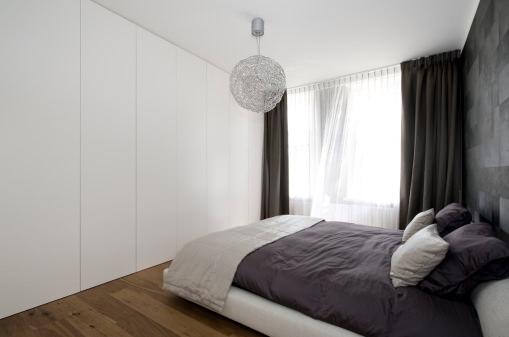
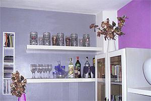
Very effective is the idea to paint a single wall of gray and leave the other white in the case of low light. Furniture, shelves, windows white or colored stand out elegantly, but without shouting, on the gray background of the wall and create with other white walls a bright, simple and enveloping.
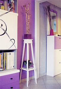
On the contrary, in the case of a bright or colored space, or maybe coated with upholstery with eccentric fantasies that we have grown tired of, it may be useful to dampen the exuberance of the environment by brushing of gray a single wall. In this way, it would continue to emphasize the existing colors, but at the same time it would give a more reassuring feeling, making the room fresher and more innovative, without having to repaint the entire room or completely remove the existing wallpaper. In the case of a room rich in furniture and accessories with a little coordination between them by color, material and shapes, as in the case of a densely furnished studio, you can reduce the sense of suffocation and disorder opting for a gray background on all the walls. Corresponding to a collective homogeneous box able to donate an air environment tidier and enveloping, reducing the effect of uncontrolled kitsch, without diminishing the character of the individual objects within the room.
Of course you can create effects of greater detachment or chromatic integration, adding a touch of gray to black, yellow, red, blue, but other colors, to steer a neutral shade to a color range that meets your needs and your ur the tastes and needs of the general color coordination.
79735 REGISTERED USERS


